Importing Libraries
Load Data
youtube <- read.csv("youtube.csv")
paged_table(youtube)
Exploration
Let’s take a look into our data set, and the first thing that I will be doing here, will be exploring the data set, trying to find patterns and understand how the data is distributed.
Which brand invested the most in advertisements?
youtube %>%
  count(brand, sort = TRUE) %>%
  head(20) %>%
  mutate(brand=fct_reorder(brand,n)) %>%
  ggplot(aes(n,brand,fill=brand)) +
  geom_bar(stat="identity") +
  theme(legend.position = "none") +
  labs(title = "Number of Ads per Brand",
       y = "Brand",
       x= "# Of Ads")
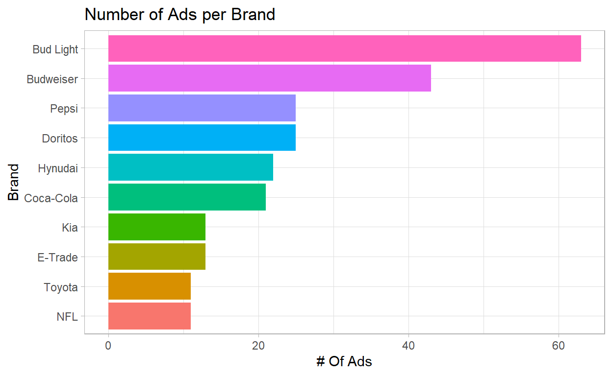
- We can see that the “beer” companies invested the most: Bud Light and Budweiser
How is the number of advertisements over the years by brands?
youtube %>%
  ggplot(aes(year,fill=brand)) +
  geom_bar() +
  facet_wrap(~ brand) +
  theme(legend.position = "none")
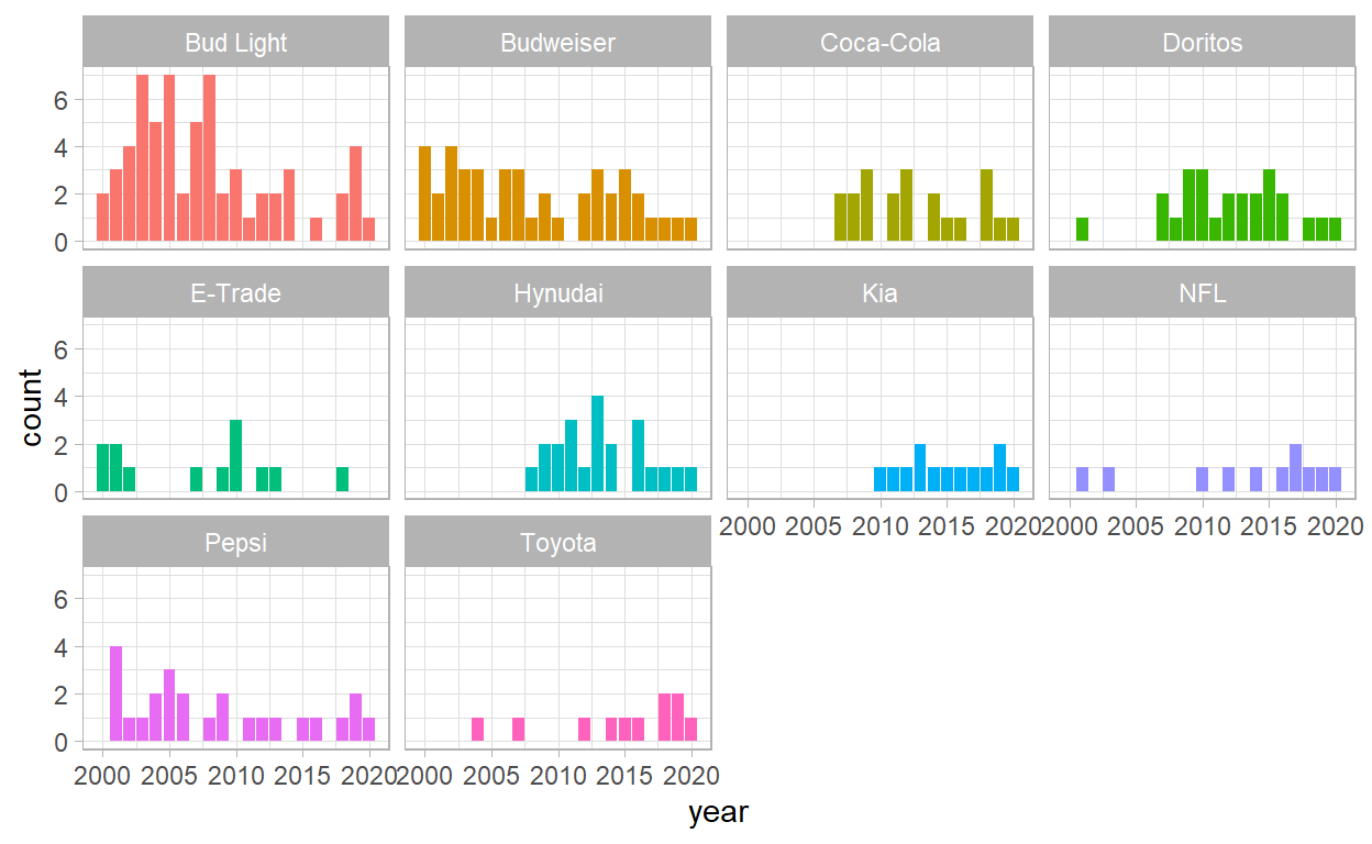
- We can see that Bud Light have decreased the number of advertisements and also in the order hand, KIA stayed very consistent over the years.
Number of Views
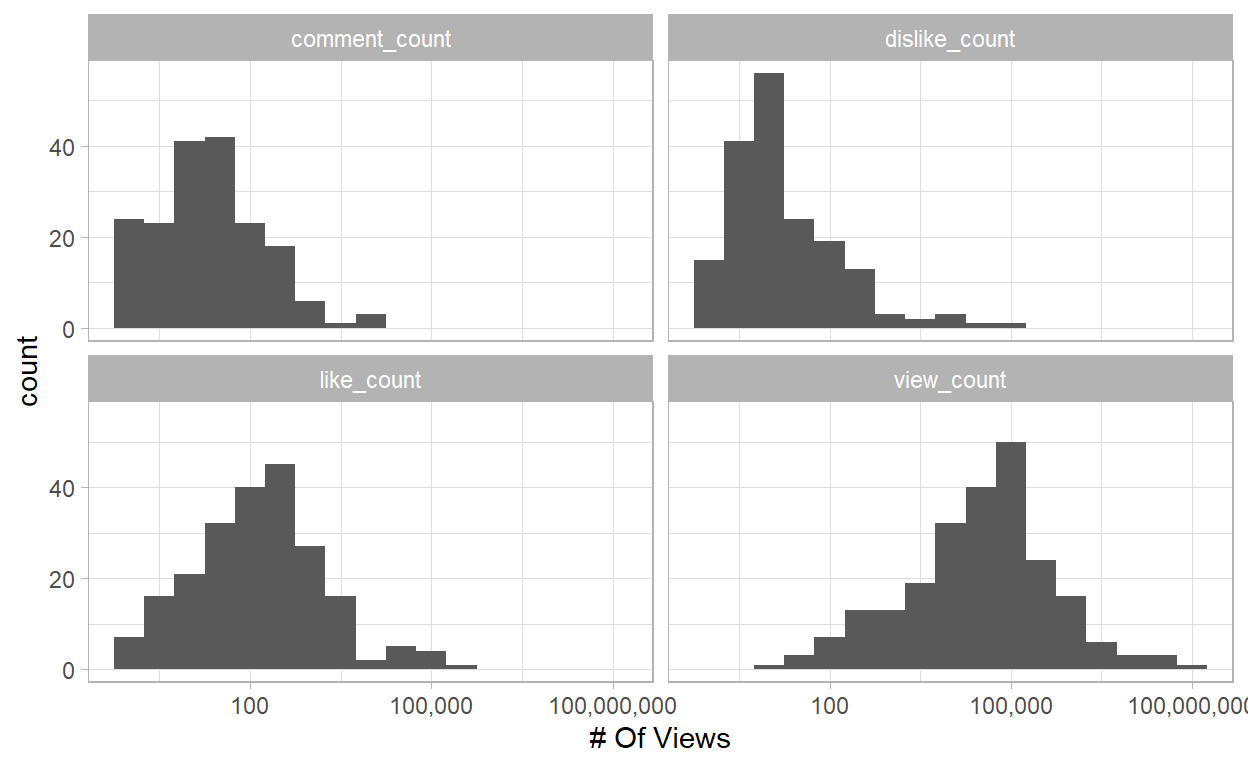
Since we are dealing with huge numbers, we will need a log scale for that:
youtube %>%
  gather(metric, value, contains("_count")) %>%
  ggplot(aes(value)) +
  geom_histogram(binwidth = .5) +
  scale_x_log10(labels=comma) +
  labs(x= "# Of Views") +
  facet_wrap(~ metric)
Number of View Counts per Brand
youtube %>%
  filter(!(is.na(view_count))) %>%
  mutate(brand=fct_reorder(brand, view_count)) %>%
  ggplot(aes(view_count, brand)) +
  geom_boxplot() +
  scale_x_log10()
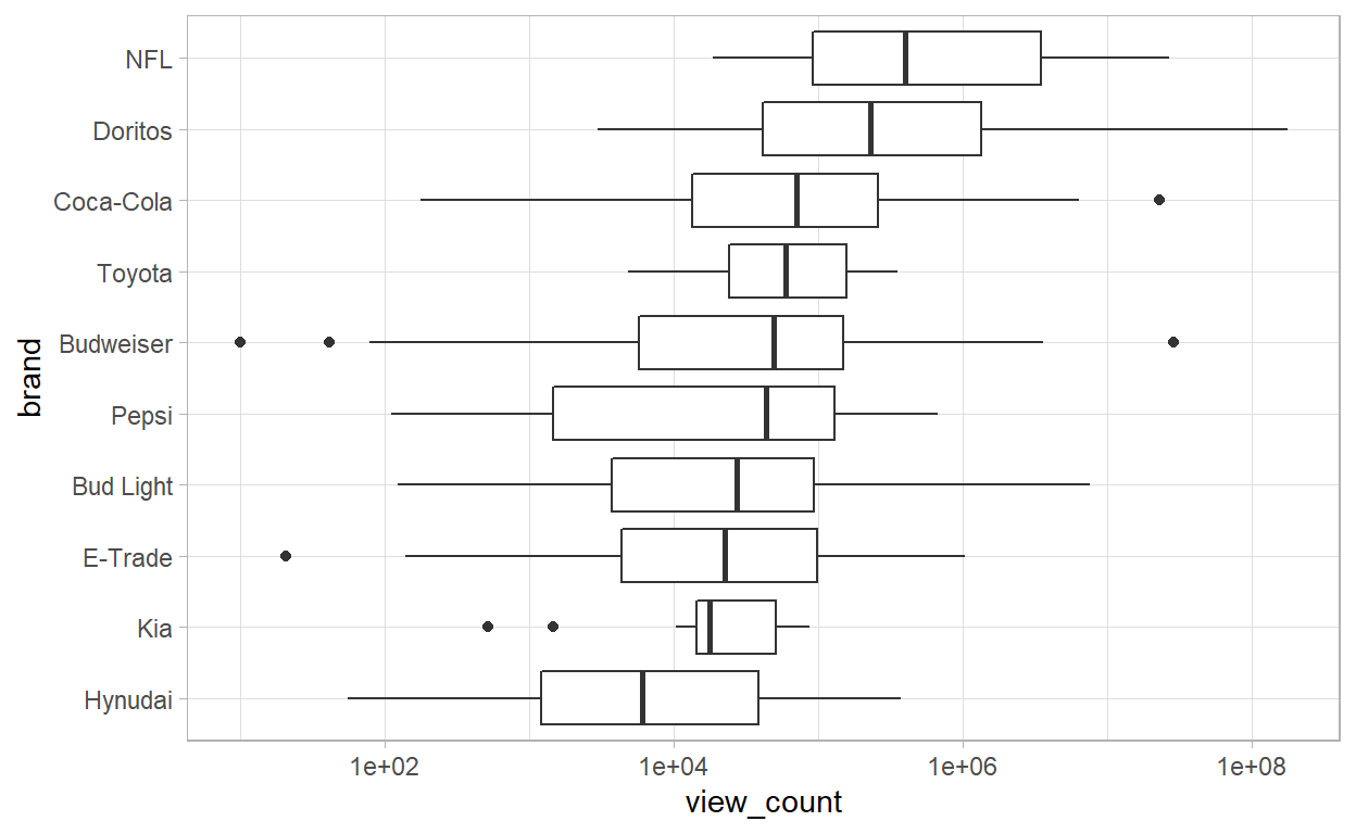
- We can see that NFL and Doritos have the highest number of views, while KIA and Hyundai have the lowest ones.
Funny Commercials have Impact of the Number of Views?
youtube %>%
  filter(!(is.na(view_count))) %>%
  mutate(brand=fct_reorder(brand, view_count)) %>%
  ggplot(aes(view_count, brand, fill=funny)) +
  geom_boxplot() +
  scale_x_log10(labels = comma)
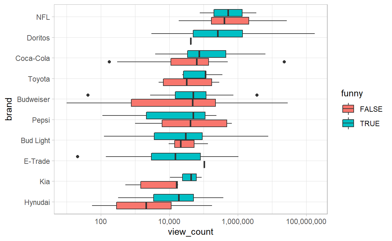
- We can not see by the plot above, a direct relatioships between funny ads and number of views. But we can say that the KIA nad Hyundai funny ads are more viewed.
Analyzing the Number of Views per Year
youtube %>%
  ggplot(aes(year, view_count, group= year)) +
  geom_boxplot() +
  scale_y_log10(labels=comma)
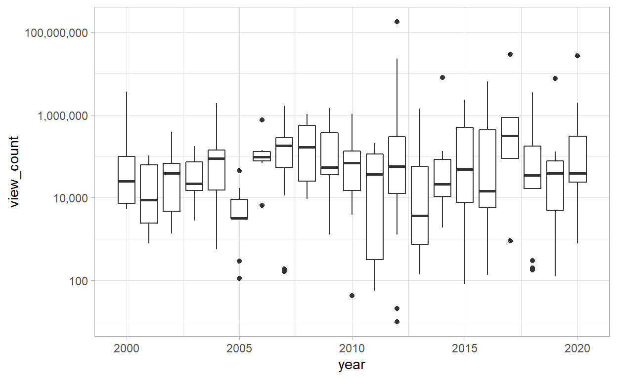
- Looking on the plot above we can not see clearly the trend of the number of views throughout the years. Perhaps we can have a better view looking into the median of views:
Median of Number of View per Year
youtube %>%
  filter(!is.na(view_count)) %>%
  group_by(year) %>%
  summarize(n=n(),
            median_views = median(view_count)) %>%
  mutate(n>=5) %>%
  ggplot(aes(year,median_views)) +
  geom_line() +
  geom_point(aes(size=n)) +
  theme(legend.position="none") +
  labs(y="Median # of Views of Super Bowl Ads")
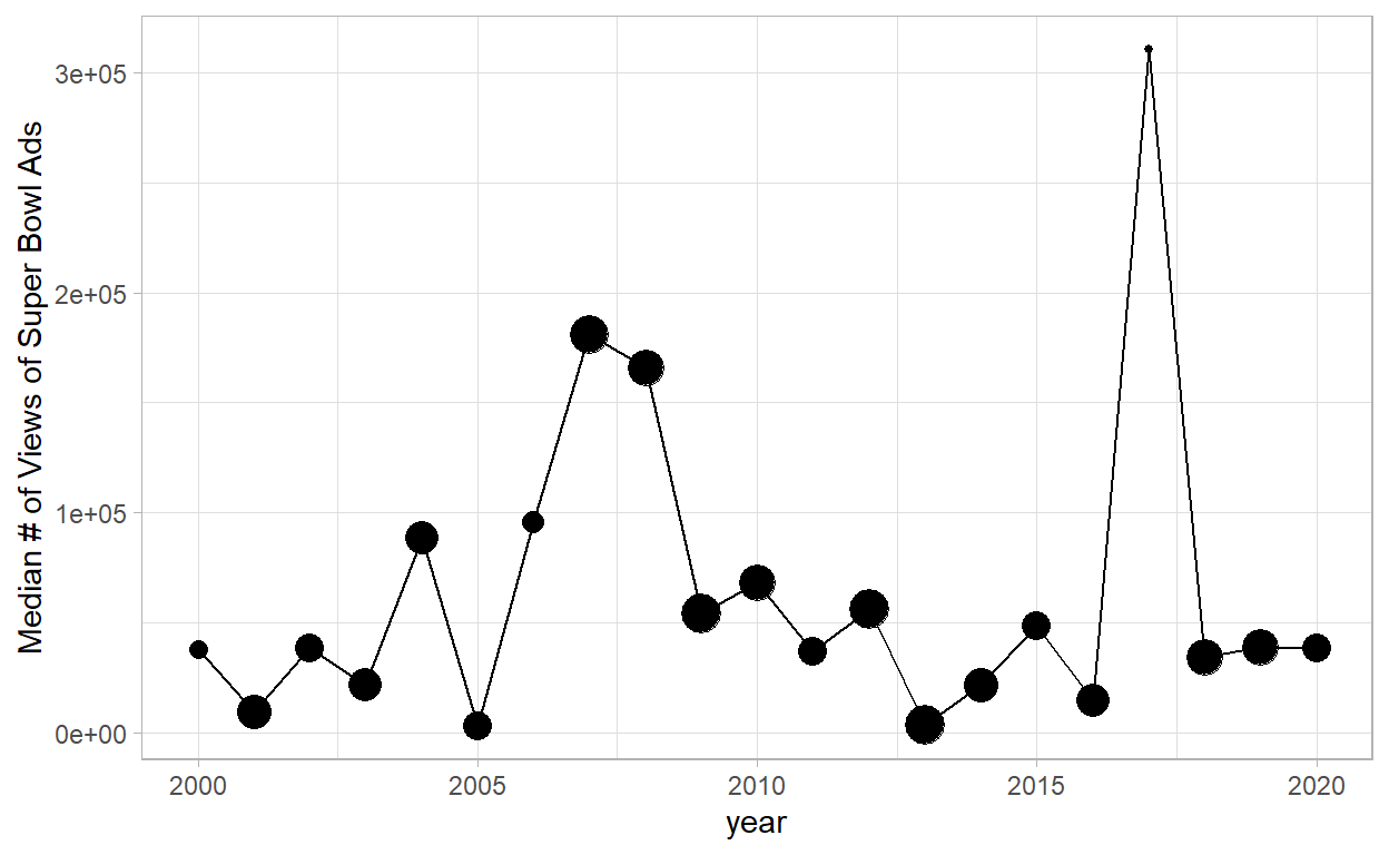
- Let’s take a look more deeply on the super high median number in 2017:
filtered <- youtube %>%
  filter(year==2017) %>%
  arrange(desc(view_count))
paged_table(filtered, options = list(rows.print = 10, cols.print = 5))
- We can see that the ads with the most number of views was from Budweiser, let’s watch the video of the remarcable ads:
Invetigating the category of Ads
youtube %>%
  filter(!is.na(view_count)) %>%
  gather(category, value, funny:use_sex) %>%
  group_by(category,value) %>%
  summarize(n= n(),
             median_view_count=median(view_count)) %>%
  ggplot(aes(category,median_view_count,fill=value))+
  geom_col(position = "dodge")
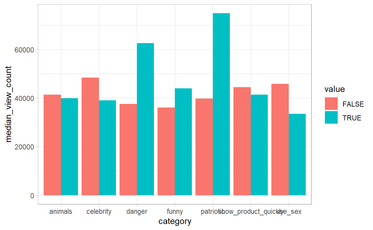
- Showing a little bit of how significant patriotism is for Americans, we can see that add which includes patriotic in it, has a significant higher number of views. The same happen with danger, but to total opposite happen with the use of sex.
What type of Ads is more comoom over time?
youtube %>%
  gather(category, value, funny:use_sex) %>%
  group_by(category=str_to_title(str_replace_all(category, "_"," ")),
           year) %>%
  summarize(pct=mean(value),
            n = n()) %>%
  ggplot(aes(year,pct,color=category))+
  geom_line()+
  scale_y_continuous(labels=percent)+
  facet_wrap(~ category) +
  theme(legend.position = "none") +
  labs(x = "Time (rounded to 2-years)",
       y = "% of ads with the quality ")
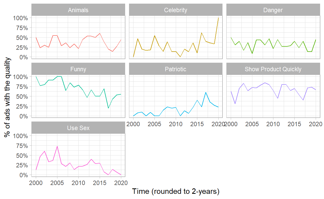
- Now we can identify some trends:
- The used of Celebrity has been increasing over last 5 years;
- And the ads with Sex content has been decreasing over time;
- Even with all the critical even that happened in 2009, he patriotic ads didn’t increasing after it.
Binomial Regression
But to be 100% sure of this, we can run a regression and look over the p values:
Call:
glm(formula = use_sex ~ year, family = "binomial", data = youtube)

Deviance Residuals:
    Min       1Q   Median       3Q      Max
-1.1383  -0.8030  -0.6207   1.2590   2.0358

Coefficients:
             Estimate Std. Error z value Pr(>|z|)
(Intercept) 194.11283   52.98301   3.664 0.000249 ***
year         -0.09710    0.02638  -3.681 0.000232 ***
---
Signif. codes:  0 '***' 0.001 '**' 0.01 '*' 0.05 '.' 0.1 ' ' 1

(Dispersion parameter for binomial family taken to be 1)

    Null deviance: 286.75  on 246  degrees of freedom
Residual deviance: 272.19  on 245  degrees of freedom
AIC: 276.19

Number of Fisher Scoring iterations: 4
Call:
glm(formula = celebrity ~ year, family = "binomial", data = youtube)

Deviance Residuals:
    Min       1Q   Median       3Q      Max
-1.0244  -0.8539  -0.7441   1.3244   1.8574

Coefficients:
              Estimate Std. Error z value Pr(>|z|)
(Intercept) -130.20092   50.15284  -2.596  0.00943 **
year           0.06430    0.02494   2.579  0.00992 **
---
Signif. codes:  0 '***' 0.001 '**' 0.01 '*' 0.05 '.' 0.1 ' ' 1

(Dispersion parameter for binomial family taken to be 1)

    Null deviance: 296.33  on 246  degrees of freedom
Residual deviance: 289.44  on 245  degrees of freedom
AIC: 293.44

Number of Fisher Scoring iterations: 4- Now, we can see even more clearly that the “use_sex” is more significant than “celebrity”, but with opposite signs.
gathered_categories <- youtube %>%
  gather(category, value, funny:use_sex) %>%
  mutate(category=str_to_title(str_replace_all(category, "_"," ")))
Type of Ads for each company thru Years
library(tidytext)
gathered_categories %>%
  group_by(brand, category) %>%
  summarize( pct = mean(value)) %>%
  ungroup() %>%
  mutate(brand = reorder_within(brand, pct, category)) %>%
  ggplot(aes(pct, brand))+
  geom_col()+
  scale_x_continuous(labels = percent)+
  scale_y_reordered()+
  facet_wrap(~ category, scales = "free_y") +
  labs( y = "",
        x= "% of brands ads have this quality")
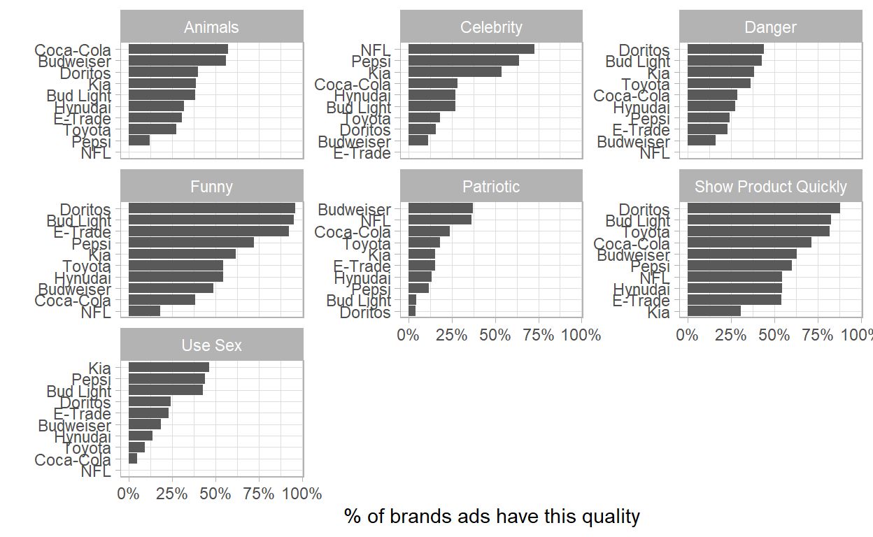
- We can see that:
- Coca Cola is the one who uses the most Animals in their Ads, and NFL never uses;
- NFL shows almost 75% at the time, celebrities in their ads;
- Doritos uses funny ads in almost 100% at the time.
Difference between types of ads in Brands
gathered_categories %>%
  group_by(brand, category) %>%
  summarize( pct = mean(value)) %>%
  ungroup() %>%
  mutate(category = reorder_within(category, pct, brand)) %>%
  ggplot(aes(pct, category))+
  geom_col()+
  scale_x_continuous(labels = percent)+
  scale_y_reordered()+
  facet_wrap(~ brand, scales = "free_y") +
  labs( y = "",
        x= "% of brands ads have this quality",
        title = "What is each brand's fingerprint in terms of the type of ads it produces?")
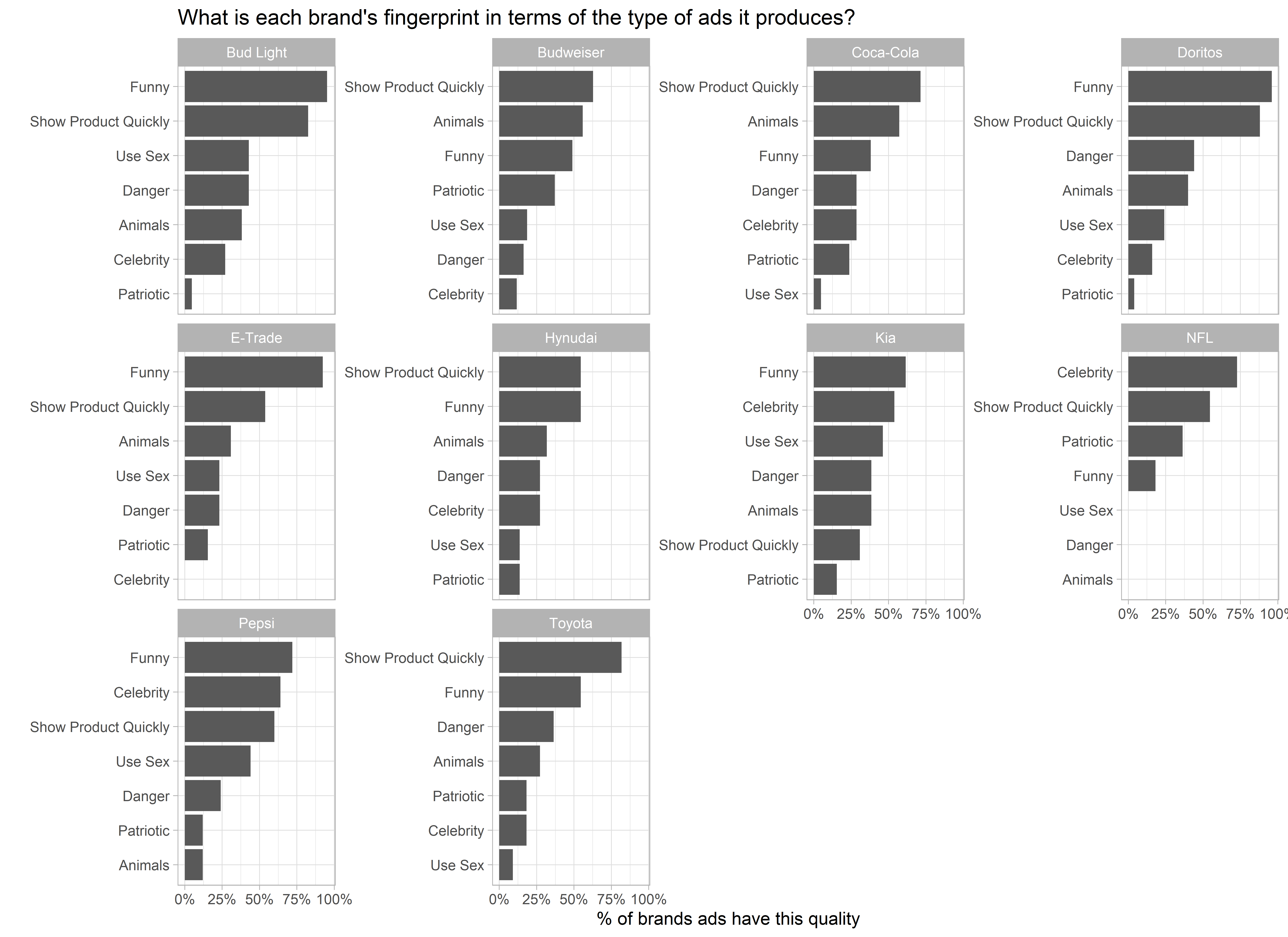
- Let’s imagine that someone came to you with this question: What is the difference between Coca Cola and Pepsi in terms of their SuPer Bowl ads?
- Their both tries to show their products quickly, where Pepsi uses more Funny ads and Coca Cola uses Animals.
- Pepsi often uses Sex and Coca Cola never uses.
Heat Map
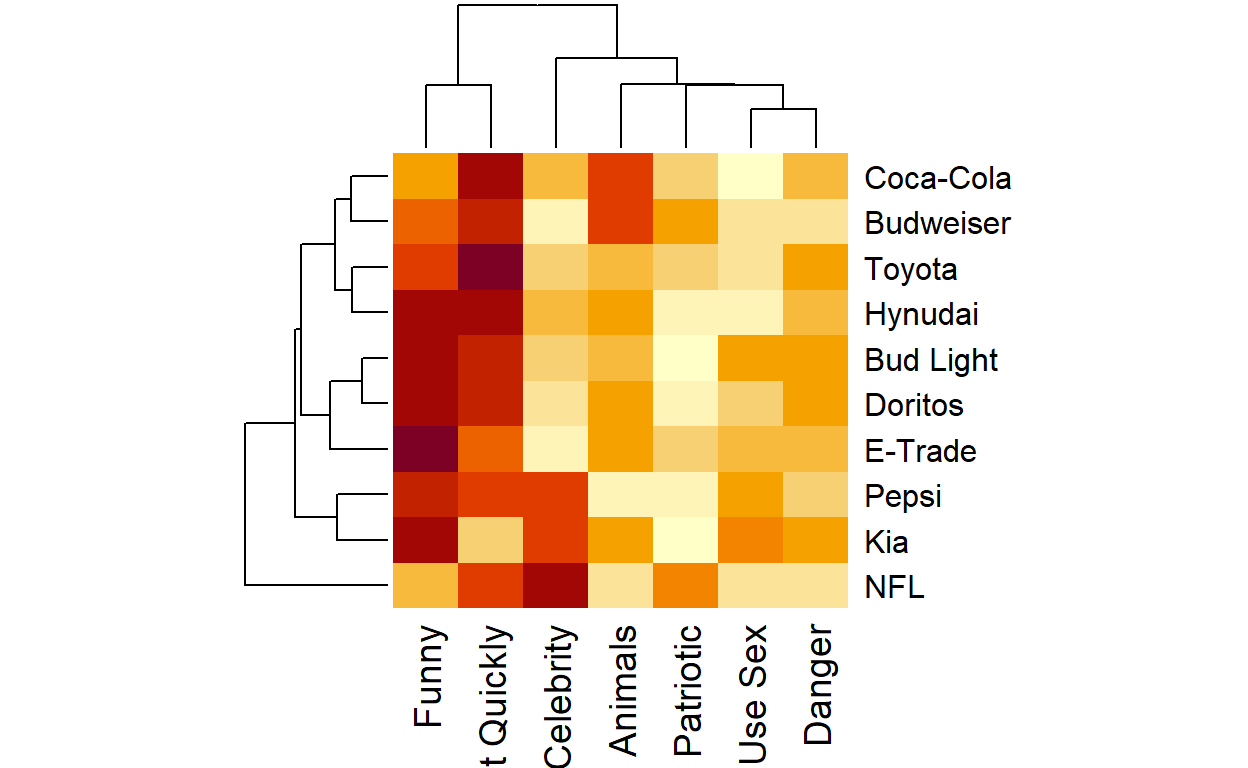
- Here we can see some correlations between brands and categories:
- Pepsi and KIA seems to have the same type of ads;
- Hyundai, Bud Light and Doritos uses a lot of funny ads;
- Coca Cola and Pepsi seems to have the same type of ads too.
Likes and Dislikes
Let’s take a look on the ratio of dislikes and likes for those brands:
likes_dislikes <- youtube %>%
  mutate(dislike_pct = dislike_count/view_count,
         like_ratio = like_count/view_count,
         like_dislike_total = like_count + dislike_count,
         dislike_pct = dislike_count/(like_count + dislike_count)) %>%
  filter(like_dislike_total >= 1000) %>%
  filter(!is.na(dislike_pct)) %>%
  select(brand, year, description, view_count, like_dislike_total,
         like_count, dislike_count, like_ratio) %>%
  arrange(desc(view_count))
likes_dislikes %>%
  mutate(dislike_pct = dislike_count/(like_count + dislike_count),
         brand = fct_reorder(brand, dislike_pct, mean)) %>%
  ggplot(aes(dislike_pct, brand)) +
  geom_boxplot() +
  scale_x_continuous(labels = percent) +
  labs(title="What brands tend to produce polarizing ads in terms of Youtube likes?",
       x = "Dislike / (Likes + Dislikes)",
       y = "Brand")
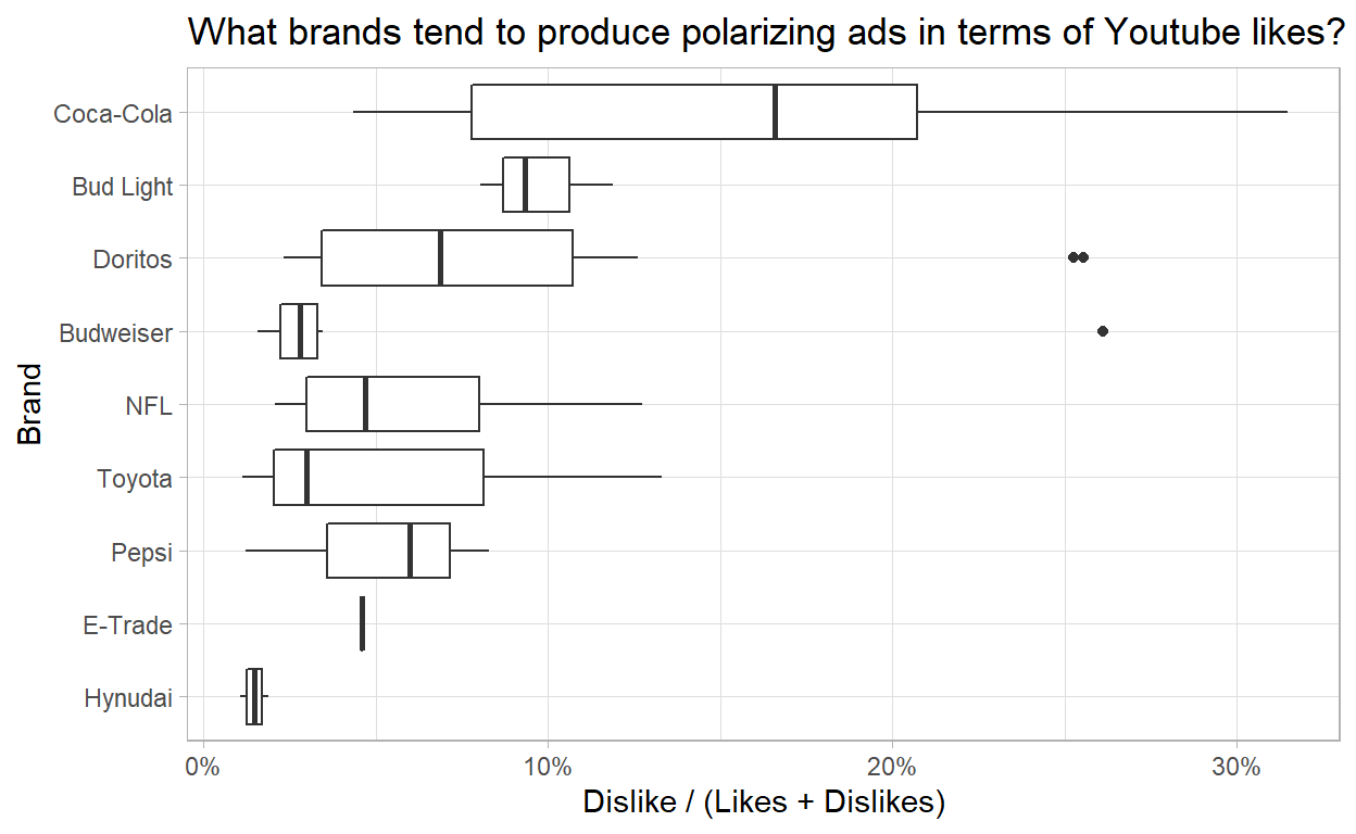
- Finally here, we see that Coca Cola has never produced an ad that got less than 4% of dislike percentage and the mean of about 16%.
End
We can do way more more where, but I will stay with those analysis for now. Thank you!