Importing Libraries
library(tidyverse)
library(scales)
library(glue)
library(countrycode)
library(rmarkdown)
theme_set(theme_light())

knitr::opts_chunk$set(
  echo = TRUE,
  message = FALSE,
  warning = FALSE
)
Loading the Data
transit_cost <- read.csv("transit_cost.csv")
transit_cost$X <- NULL
paged_table(transit_cost)
Cleaning the Data
Let’s filter the missing values, and add the country names to the column which has only the code for those countries.
transit_cost <- transit_cost %>%
  filter(!is.na(e)) %>%
  mutate(country_code=ifelse(country == "UK", "GB",country),
         country = countrycode(country_code,"iso2c","country.name"),
         real_cost=as.numeric(real_cost),
         tunnel_per = tunnel / length)
Exploring
Cost of Construction in the US by City per Year
transit_cost %>%
  filter(country=="United States") %>%
  mutate(line=fct_reorder(line,year)) %>%
  ggplot(aes(xmin=start_year,xmax=end_year,
             y=line,color=city,size=real_cost)) +
  geom_errorbarh(height=.1) +
  labs(x = "Year",
       y ="",
       color = "City",
       title = "Cost of Construction in the US by City per Year")
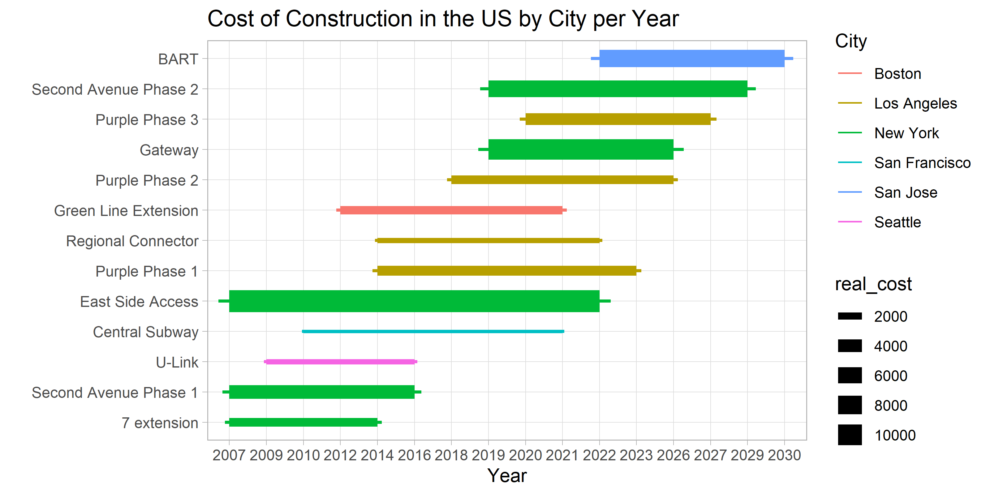
- It seems that the cost of the East Side Access in NYC is the hights and the lowest is the Central Subway in San Jose.
Cost/Km for Each Country
We will filter only by the constructions that are 100% completed.
transit_cost %>%
  filter(!is.na(cost_km_millions),
         tunnel_per == 1) %>%
  mutate(country=fct_lump(country,12)) %>%
  add_count(country) %>%
  mutate(country = glue("{ country } ({ n })"),
         country=fct_reorder(country,cost_km_millions,na.rm=TRUE)) %>%
  ggplot(aes(cost_km_millions,country))+
  geom_boxplot()+
  scale_x_continuous(labels = dollar)+
  labs(x="Cost/Km (Millions of USD)",
       y="")
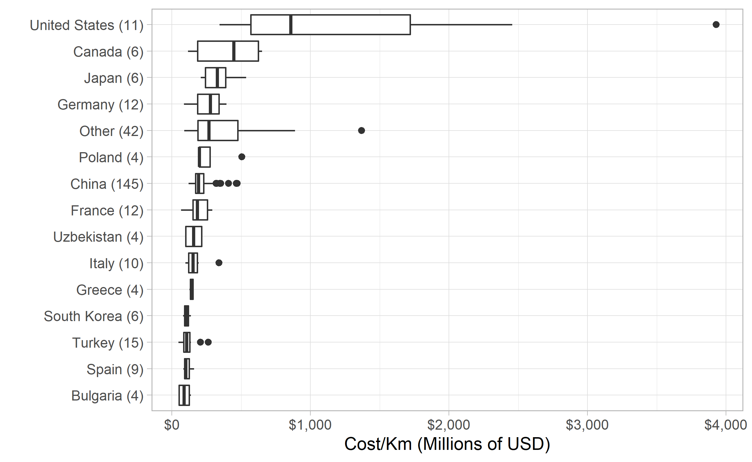
We can see that is a huge discrepancy comparing US with other countries in the world. Why is so much more expensive here?
There is also one construction that cost almost 4 Billion dollars per Kilometer! Which one is that?
- East Side Access in NYC
Railroads are cheaper than Trains to construction?
transit_cost %>%
  filter(!is.na(cost_km_millions),
         tunnel_per == 1) %>%
  mutate(country=fct_lump(country,12)) %>%
  add_count(country) %>%
  mutate(country = glue("{ country } ({ n })"),
         country=fct_reorder(country,cost_km_millions,na.rm=TRUE)) %>%
  ggplot(aes(cost_km_millions,country,fill=factor(rr)))+
  geom_boxplot()+
  scale_x_continuous(labels = dollar)+
  labs(x="Cost/Km (Millions of USD)",
       y="")
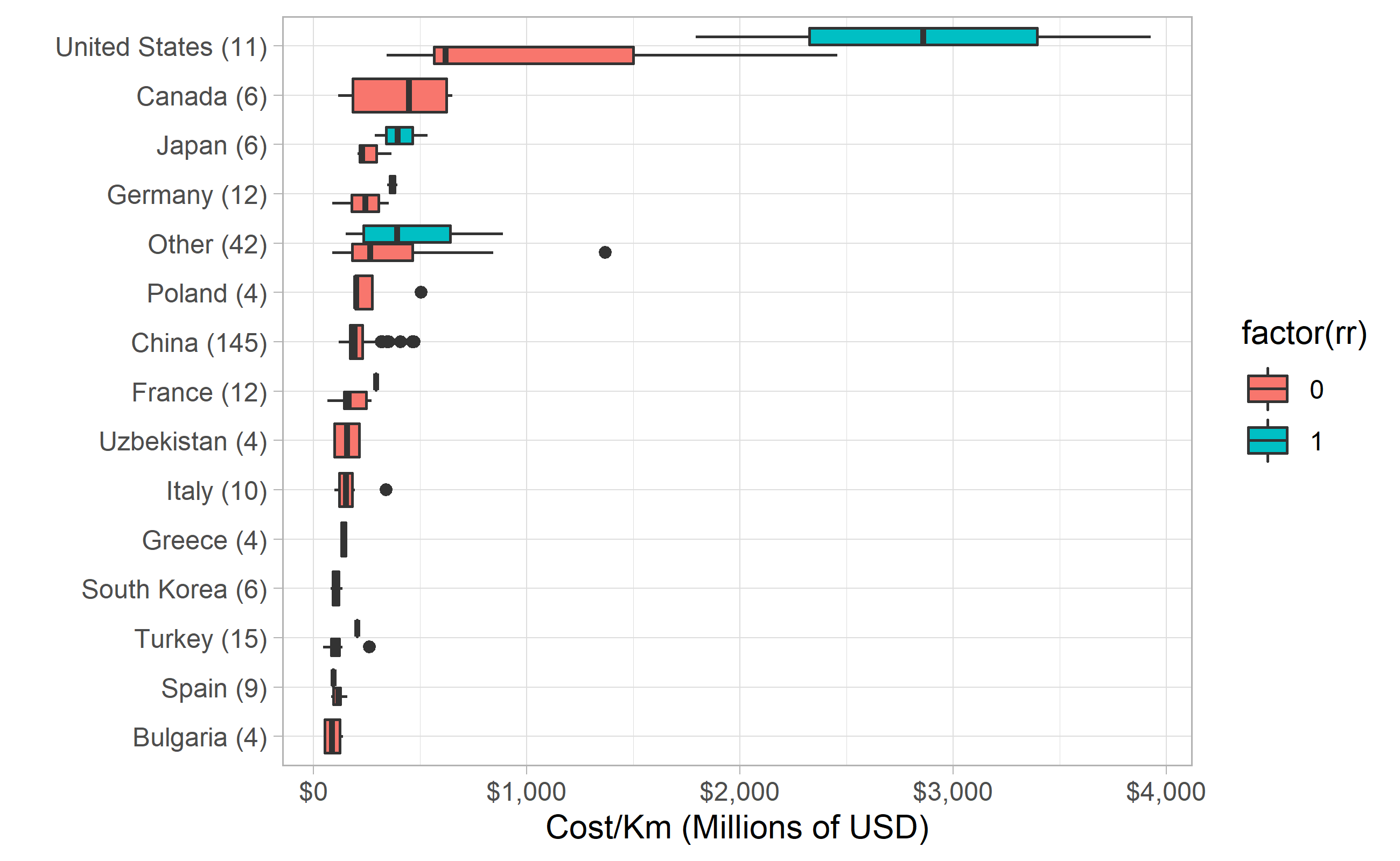
- No! The rail roads are more expensive every country in our data set.
Looking at China
Most information that we can per country cames from China, so it is reasenable to take a deeper look into it:
transit_cost %>%
  filter(!is.na(cost_km_millions),
         country=="China",
         tunnel_per == 1) %>%
  mutate(city=fct_lump(city,12)) %>%
  add_count(city) %>%
  mutate(city = glue("{ city } ({ n })"),
         city=fct_reorder(city,cost_km_millions,na.rm=TRUE)) %>%
  ggplot(aes(cost_km_millions,city))+
  geom_boxplot()+
  scale_x_continuous(labels = dollar)+
  labs(x="Cost/Km (Millions of USD)",
       y="",
       title = "Cost/Km in Chinese Cities") +
  expand_limits(x=0)
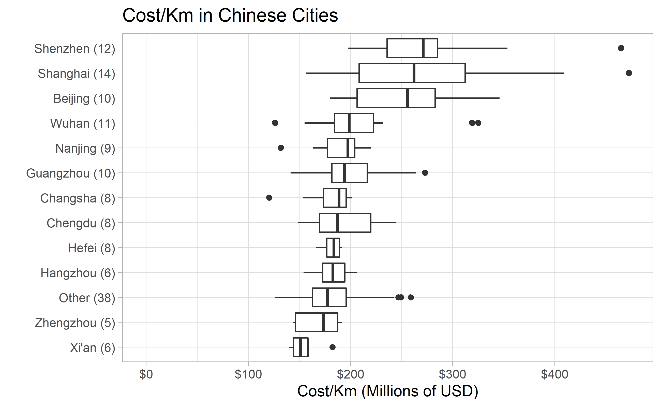
- The top 3 more expensive cities are Shenzhen, Shanghai and Beijing.
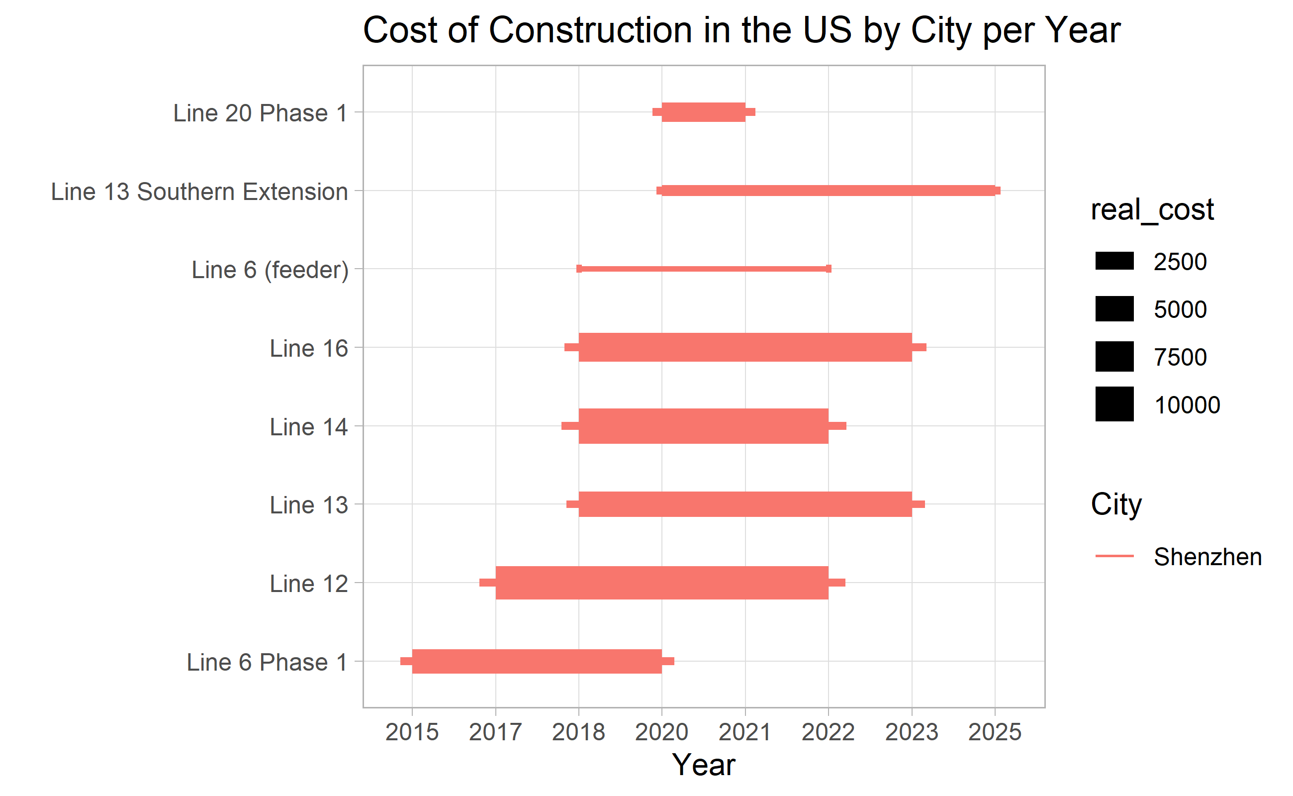
Looking at Shenzhen
transit_cost %>%
  filter(country=="China",
         city=="Shenzhen",
         !is.na(start_year),
         !is.na(end_year)) %>%
  mutate(city = fct_lump(city,5)) %>%
  mutate(line=fct_reorder(line,year)) %>%
  ggplot(aes(xmin=start_year,xmax=end_year,
             y=line,color=city,size=real_cost)) +
  geom_errorbarh(height=.1) +
  labs(x = "Year",
       y ="",
       color = "City",
       title = "Cost of Construction in the US by City per Year")
Cost Distribution/Km in China
transit_cost %>%
  filter(tunnel_per==1,
         end_year<=2020,
         country=="China") %>%
  mutate(year=(year%%5)*5) %>%
  ggplot(aes(year,cost_km_millions,group=year))+
  geom_boxplot()+
  expand_limits(y=0)+
  labs(y="Cost/km (Real USD, Millions)",
       x = "Year",
       title="Cost Distribution/ Km in China")
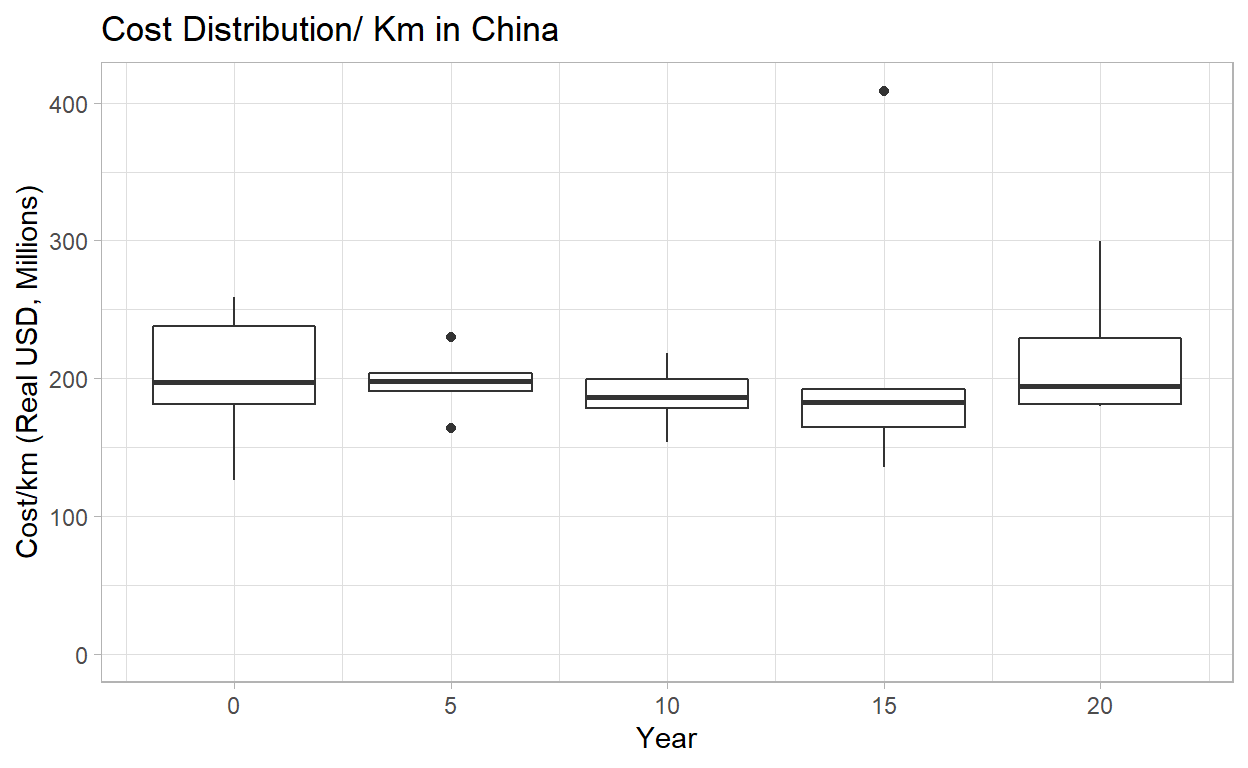
- Prices in China ranged from slighty above 200M/KM to a bit under 200M/KM from 2000 to 2015, and have since risen a bit.
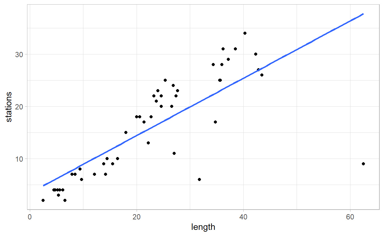
Correlation Between Number of Stations and Lenght
transit_cost %>%
  filter(tunnel_per==1,
         end_year<=2020,
         country=="China") %>%
  ggplot(aes(length,stations))+
  geom_point()+
  geom_smooth(method = lm, se=FALSE)
expand_limits(x=0,y=0)
mapping: x = ~x, y = ~y
geom_blank: na.rm = FALSE
stat_identity: na.rm = FALSE
position_identity - We can see a clear correlation between the number of stations and their length, but also some other but where there is few stations with a huge length (assumption: train across distant cities and not within one city)
Correlation Between Stations/Km and Cost/Km
transit_cost %>%
  filter(tunnel_per==1,
         end_year<=2020,
         country=="China") %>%
  mutate(city=fct_lump(city,4)) %>%
  ggplot(aes(stations/length, cost_km_millions, size=length,color=city))+
  geom_point()+
  expand_limits(x=0,y=0)+
  labs(x="Station/Km",
       y="Cost/Km")
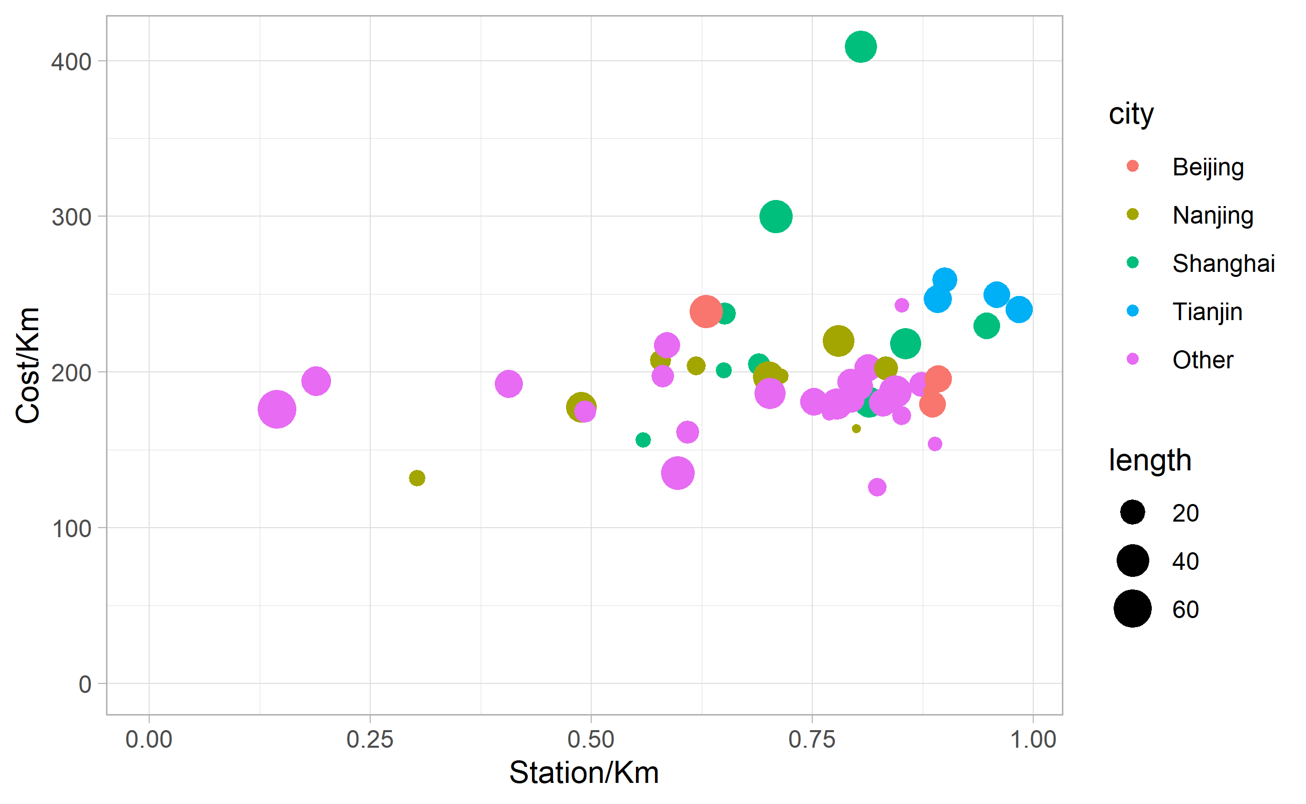
No strong relationship between stations/km and cost/km. That is quite surprising in my point of view, because I would assume that the highest number of stations to build, the most expensive would be the project. Appears to not be the case in the end.
Thank you!